I follow a blog that looks at the way folks visualize data. Its called Flowing Data.
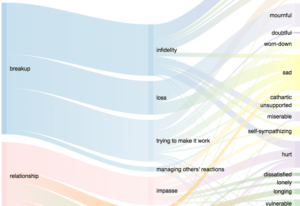
In a post today they link to a post by Robin Weis where she has tracked every time she cried over the span of 589 days (Feb 20, 2014 to Oct 1, 2015). The full post is here: Crying. One of the more interesting visualizations (which is also interactive on the full post) is partly shown here:

Breakups and relationships were the root of 63% of the total cries. The data spanned the majority of a year-long, long-distance relationship, the entirety of a breakup, a little bit of dating, and the very beginning of another relationship. The breakup was a terrible mess during which I found out that my ex was actually married, and the lies and trauma caused 40% of my total crying.
She also has a great post visualizing 8 years of dating (with little notes on each relationship/first date): 8 Years of Dating Data

